1.2 Summarizing Numerical Data
1.2.1 Objectives
By the end of this unit, students will be able to:
- Summarize and describe numerical data using various visual displays including histograms and dotplots.
- Idnetify skewness in the distribution of numerical data.
- Use summary statistics such as mean and median to describe central tendancy of the data.
- Use summary statistics such as variance, standard deviation, and quartiles to describe variability of the data.
- Identify potential outliers in the data using boxplots.
1.2.2 Overview
Numerical (quantitative) variables are those where arithmetic operations are meaningful. These variables can be continuous (measured, such as height or hours of sleep) or discrete (counted, such as number of siblings or countries visited).
To effectively summarize numerical data, we describe two main features:
- The center — where typical values fall.
- The spread — how much variability is present in the data.
Visualizations such as dotplots, histograms, and boxplots reveal patterns of distribution, while summary statistics provide precise numerical descriptions.
Measures of Center
Two common measures describe the “middle” of a dataset:
Mean (average): \[ \bar{x} = \frac{1}{n}\sum_{i=1}^n x_i \]
The mean uses all observations but can be influenced by extreme values. For example, if most students sleep 7 hours but one reports only 2 hours, the mean is pulled downward.Median (middle value):
The midpoint of the ordered data. If \(n\) is even, it is the average of the two middle values. The median is more resistant to outliers and skewness.
Example: In a classroom survey, the average number of countries visited may be distorted by one well-traveled student, while the median provides a better description of a “typical” student.
Measures of Spread
Center alone cannot describe data fully. Consider two door-to-door canvassers: both knock on an average of 25 doors daily, but one knocks consistently around that value while the other varies widely from 0 to 50.
Key measures of spread include:
Range: Maximum - Minimum. Quick but sensitive to outliers.
Standard Deviation (SD):
Measures the average distance of observations from the mean:
\[ s = \sqrt{\frac{\sum (x_i - \bar{x})^2}{n-1}} \]
Squaring deviations prevents positive and negative differences from canceling and emphasizes large deviations.Interquartile Range (IQR):
The spread of the middle 50% of data:
\[ IQR = Q_3 - Q_1 \]
Less sensitive to extremes, making it useful for skewed data.Five-number summary: Minimum, \(Q_1\), Median, \(Q_3\), Maximum. Basis for boxplots.
Shape and Skewness
Distributions can be:
- Symmetric: mean \(\approx\) median (e.g., exam scores centered around 75).
- Right-skewed: mean > median (e.g., number of countries visited, income).
- Left-skewed: mean < median (e.g., age of retirement for early-exit workers).
In skewed data, the median + IQR provide more reliable summaries than mean + SD.
1.2.4 Solved Exercises
Exercise 1. Use the following dot plot of an interest rate of some loan data to answer questions.
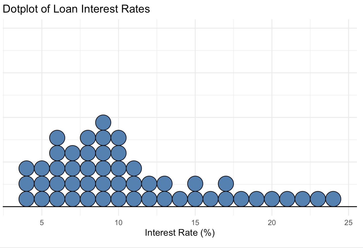
(a). How many loans?
(b). What is the lowest interest rate? What is the highest interest rate? Find the range.
(c). Find the mean (average).
(d). Find the median.
Help: Using R,
x <- c(4,4,4,5,5,5,6,6,6,6,6, 7,7,7,7,8,8,8,8,8,9, 9,9,9,9,9,10,10,10,10, 10,11,11,11,12,12,13,13, 14,15,15,16,17,17,18,19, 20,21,22,23,24)length(x)mean(x)median(x)
Solution: (a) There are 50 loans in total.
The lowest interest rate is \(4\%\), and the highest is \(24\%\).
Hence, the range is \(24 - 4 = 20\).The mean (average) interest rate is approximately \(\bar{x} = 10.76\%\).
The median interest rate is \(9\%\).
Exercise 2.
When we have a distribution where all observations are greater than 0, that is, all \(x_i > 0\),
the statistic
\[ \frac{\text{mean}}{\text{median}} \]
can be used as a measure of skewness. What is the expected shape of the distribution under the following conditions? Sketch the shape to illustrate.
\(\frac{\text{mean}}{\text{median}} = 1\)
\(\frac{\text{mean}}{\text{median}} < 1\)
\(\frac{\text{mean}}{\text{median}} > 1\)
Solution:
- When \(\frac{\text{mean}}{\text{median}} = 1\), the mean equals the median.
This indicates a symmetric distribution (no skewness).
\[ \text{Mean} = \text{Median} \Rightarrow \text{Symmetric distribution.} \]
- When \(\frac{\text{mean}}{\text{median}} < 1\), the mean is less than the median.
This occurs when the left tail of the distribution is longer, meaning it is left-skewed (negatively skewed).
\[ \text{Mean} < \text{Median} \Rightarrow \text{Left-skewed distribution.} \]
- When \(\frac{\text{mean}}{\text{median}} > 1\), the mean is greater than the median.
This occurs when the right tail is longer, meaning the distribution is right-skewed (positively skewed).
\[ \text{Mean} > \text{Median} \Rightarrow \text{Right-skewed distribution.} \]
Exercise 3.
For given two data sets:
Data (1): 0, 3, 5, 7, 7, 11
Data (2): 21, 23, 25, 27, 29, 31
Sketch the dot plots.
Compare their means. What general observation can you draw?
Compare their standard deviations. What general observation can you draw?
What about their IQRs?
Solution:
The dot plots for both data sets have identical spacing and shape, but Data (2) is shifted to the right on the number line.
Compute the means:
\[ \bar{x}_1 = \frac{0 + 3 + 5 + 7 + 7 + 11}{6} = \frac{33}{6} = 5.5 \]
\[ \bar{x}_2 = \frac{21 + 23 + 25 + 27 + 29 + 31}{6} = \frac{156}{6} = 26 \]
Both data sets have the same spread, but the mean of Data (2) is higher.
\[
\Rightarrow \text{Data (2) is a shifted version of Data (1).}
\]
- Since both data sets have equal spacing between corresponding observations, their standard deviations are the same.
\[ s_1 = s_2 \]
\[ \Rightarrow \text{Equal variability, only location differs.} \]
- Their IQRs are also equal, since shifting data by a constant does not affect spread.
\[ IQR_1 = IQR_2 \]
\[ \Rightarrow \text{Same spread, different center.} \]
Exercise 4.
Find the quartiles and interquartile range (IQR) for each data set.
\(3, 5, 12, 12, 16\)
\(4, 2, 9, 10, 12, 18\)
Solution:
- Ordered data: \(3, 5, 12, 12, 16\)
\[ Q_1 = 5, \quad Q_2 = 12, \quad Q_3 = 12 \]
\[ IQR = Q_3 - Q_1 = 12 - 5 = 7 \]
- Ordered data: \(2, 4, 9, 10, 12, 18\)
\[ Q_1 = \frac{4 + 9}{2} = 6.5, \quad Q_2 = \frac{9 + 10}{2} = 9.5, \quad Q_3 = \frac{12 + 18}{2} = 15 \]
\[ IQR = Q_3 - Q_1 = 15 - 6.5 = 8.5 \]
Exercise 5. The histogram below shows the ages (in years) of laptops available for resale at a local electronics shop.

(a). How many laptops are in the first class (between 0 and 1 years)? In the third class (between 2 and 3 years)?
(b). Describe the shape of the histogram – how many modes? Symmetric or skewed (left or right)?
(c). Which measure is more appropriate to use to measure the center? Mean or median?
(d). Which measure is more appropriate to use to measure the spread? Standard deviation or IQR?
Solution: (a) There are approximately 47 laptops in the first class (between 0 and 1 years) and about 20 laptops in the third class (between 2 and 3 years).
The distribution is right-skewed (positively skewed) with one mode (unimodal). Most laptops are relatively new, with fewer older ones.
Since the data are skewed, the median is a more appropriate measure of center than the mean.
For the same reason, the IQR (interquartile range) is a better measure of spread than the standard deviation.
Exercise 6. Identify the histogram for the frequency distribution below.
| Bin | Frequency |
|---|---|
| [2, 7] | 3 |
| [7, 12] | 1 |
| [12, 17] | 3 |
| [17, 22] | 7 |
| [22, 27] | 1 |
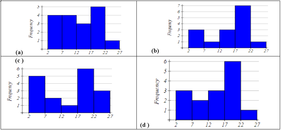
Solution:
The correct answer is b
Exercise 7. Based on the boxplot below:

(a). Write the five number summary.
(b). What percent of data is below 13?
Solution: a) The five-number summary is approximately:
\[ \text{Min} = 10, \quad Q_1 = 12, \quad \text{Median} = 13, \quad Q_3 = 17, \quad \text{Max} = 20 \]
- Since the first quartile \(Q_1 = 12\) and the median \(= 13\), we know that 25% of the data lie below \(Q_1\), and 50% of the data lie below the median.
Therefore, approximately 50% of the data are below 13.