```{r setup, include=FALSE} knitr::opts_chunk$set(echo = FALSE) ``` ```{r, echo=F, message=F, warning=F} library(readr) library(openintro) library(datasets) library(tidyverse) library(scales) data(COL) ``` # Considering categorical data ## Contingency tables A table that summarizes data for two categorical variable is called a **contingency table**. \pause The contingency table below shows the distribution of survival and ages of passengers on the Titanic. \begin{table}[] \begin{tabular}{ccccc} & & \multicolumn{2}{c}{Survival} & \\ \cline{3-4} & & Died & Survived & Total \\ \cline{2-5} \multirow{2}{*}{Age} & Adult & 1438 & 654 & 2092 \\ & Child & 52 & 57 & 109 \\ \cline{2-5} & Total & 1490 & 711 & 2201 \\ \cline{2-5} \end{tabular} \end{table} ## Bar Plots A **bar plot** is a common way to display a single categorical variable. A bar plot where proportions instead of the frequencies are shown is called a **relative frequency bar plot**. \begin{multicols}{2} ```{r, echo=F, message=F, out.width="100%",warning=F,fig.align='center'} age_survived <- apply(Titanic, c(3, 4), sum) titanic_data <- tibble( Age = c(rep("Child", 52 + 57), rep("Adult", 1438 + 654)), Survival = c(rep("Died", 52), rep("Survived", 57), rep("Died", 1438), rep("Survived", 654)) ) ggplot(titanic_data, aes(x = Survival)) + geom_bar(fill = COL[1]) + labs(y = "Frequency") + theme_bw(base_size = 25) ``` \columnbreak ```{r, echo=F, message=F, out.width="100%",warning=F,fig.align='center'} ggplot(titanic_data, aes(x = Survival)) + geom_bar(aes(y = (..count..)/sum(..count..)), fill = COL[1]) + labs(y = "Relative frequency") + scale_y_continuous(labels=percent) + theme_bw(base_size = 25) ``` \end{multicols} \pause \alert{How are bar plots different than histograms?} \pause \footnotesize Bar plots are used for displaying distributions of categorical variables, histograms are used for numerical variables. The x\-axis in a histogram is a number line, hence the order of the bards cannot be changed. In a bar plot, the categories can be listed in any order (though some ordering make more sense than others, especially for ordinal variables.) ## Choosing the appropriate proportion \alert{Does there appear to be a relationship between age and survival for passengers on the Titanic?} \begin{table}[] \begin{tabular}{ccccc} & & \multicolumn{2}{c}{Survival} & \\ \cline{3-4} & & Died & Survived & Total \\ \cline{2-5} \multirow{2}{*}{Age} & Adult & 1438 & 654 & 2092 \\ & Child & 52 & 57 & 109 \\ \cline{2-5} & Total & 1490 & 711 & 2201 \\ \cline{2-5} \end{tabular} \end{table} \pause To answer this question we examine the row proportions: \pause - % Adults who survived: 654 / 2091 $\approx$ 0.31 \pause - % Children who survived: 57 / 109 $\approx$ 0.52 ## Bar plots with two variables - **Stacked bar plot:** Graphical display of contingency table information, for counts. - **Side\-by\-side bar plot:** Displays the same information by placing bars next to, instead of on top of, each other. - **Standardized stacked bar plot:** Graphical display of contingency table information, for proportions. ## Bar plots with two variables \alert{What are the difference between the three visualizations shown below?} \begin{multicols}{2} ```{r, echo=F, message=F, out.width="100%",warning=F,fig.align='center'} ggplot(titanic_data, aes(x = Age, fill = Survival)) + geom_bar() + labs(y = "Frequency") + theme_bw(base_size = 25) + scale_fill_manual(values = c(COL[1], COL[1,3]), breaks = c("Died", "Survived")) ``` \columnbreak ```{r, echo=F, message=F, out.width="100%",warning=F,fig.align='center'} ggplot(titanic_data, aes(x = Age, fill = Survival)) + geom_bar(position = "dodge") + labs(y = "Frequency") + theme_bw(base_size = 25) + scale_fill_manual(values = c(COL[1], COL[1,3]), breaks = c("Died", "Survived")) ``` \end{multicols} ```{r, echo=F, message=F, out.width="47%",warning=F,fig.align='center'} ggplot(titanic_data, aes(x = Age, fill = Survival)) + geom_bar(position = "fill") + labs(y = "Relative frequency") + theme_bw(base_size = 25) + theme(axis.title.x = element_text(vjust=2.5))+ scale_fill_manual(values = c(COL[1], COL[1,3]), breaks = c("Died", "Survived")) ``` ## Mosaic plots \alert{What is the difference between the two visualizations shown below?} \begin{multicols}{2} ```{r, echo=F, message=F, out.width="110%",warning=F,fig.align='center'} ggplot(titanic_data, aes(x = Age, fill = Survival)) + geom_bar(position = "fill") + labs(y = "Relative frequency") + theme_bw(base_size = 25) + scale_fill_manual(values = c(COL[1], COL[1,3]), breaks = c("Died", "Survived")) ``` \columnbreak ```{r, echo=F, message=F, out.width="110%",warning=F,fig.align='center'} mosaicplot(table(titanic_data$Age, titanic_data$Survival), color = c(COL[1],COL[1,3]), ylab = "", main = "", cex.axis = 2) ``` \end{multicols} ## Pie charts 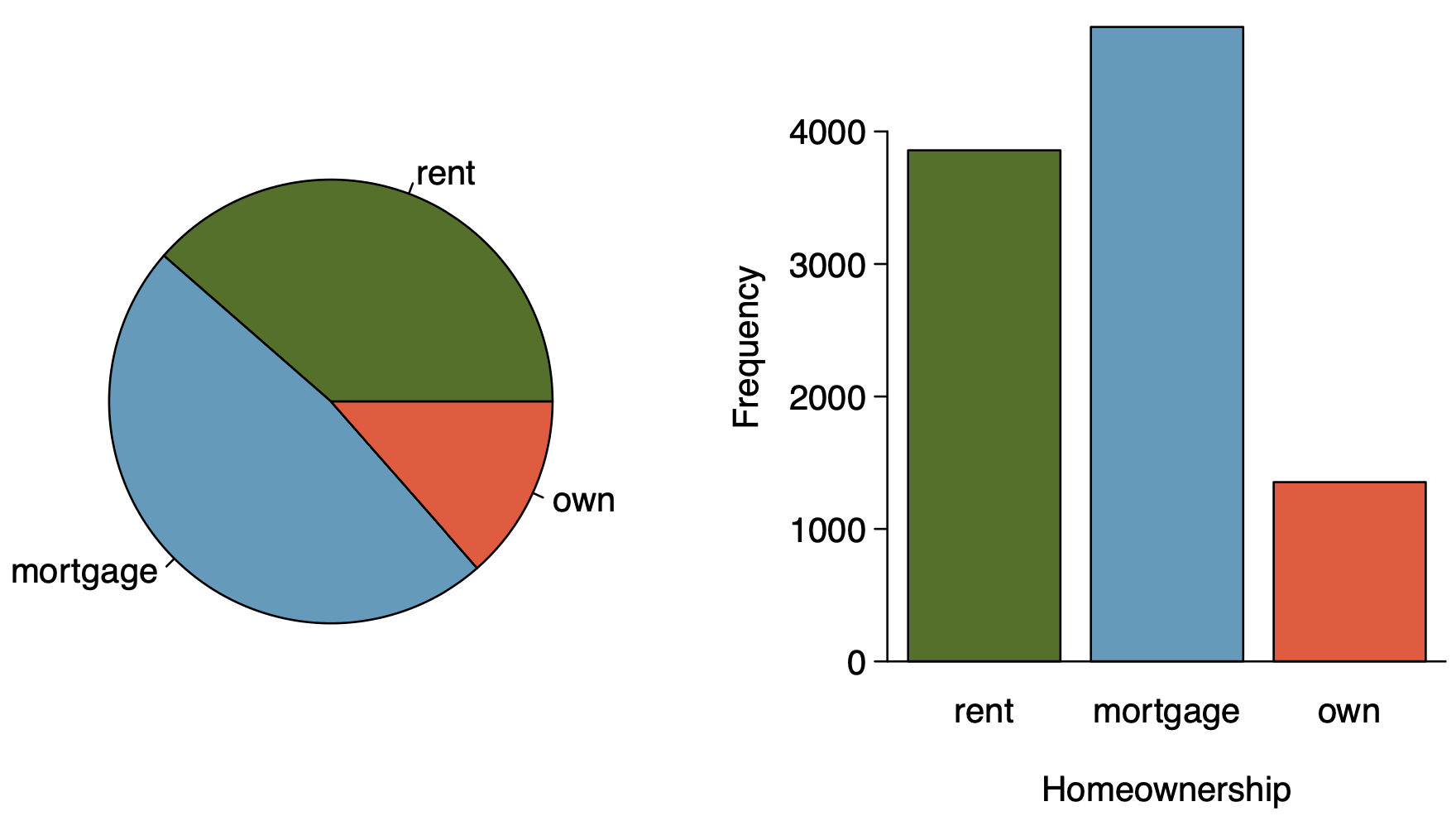 ## Pie charts \alert{Can you tell which order excompasses the lowest percentage of mammal species?} ```{r, echo=F, message=F, out.width="100%",warning=F,fig.align='center',include=FALSE,eval=FALSE} d = read_csv("dataset/msw3-all.csv") colors = rev(as.vector(COL)) pie(sort(table(d$Order)), labels="", col = c(colors,"white")) ``` ```{r, echo=F, message=F, out.width="100%",warning=F,fig.align='center',include=F,eval=FALSE} plot.new() legend("center", names(rev(sort(table(d$Order)))), fill = rev(c(colors,"white"))) ``` {width="60%"} {width="25%"} ## Side\-by\-side box plots \alert{Does there appear to be a relationship between class year and number of clubs studetns are in?} ```{r, echo=F, message=F, out.width="100%",warning=F,fig.align='center'} d = read.csv("dataset/year_clubs.csv") d$year = factor(d$year, levels = c("First-year","Sophomore","Junior","Senior","Grad student")) d = d[d$year != "Grad student",] d$year = droplevels(d$year) # box par(cex.axis=1.1, cex=1.2) boxPlot(d$clubs, fact = d$year, col = COL[1], ylab = "number of clubs") ```